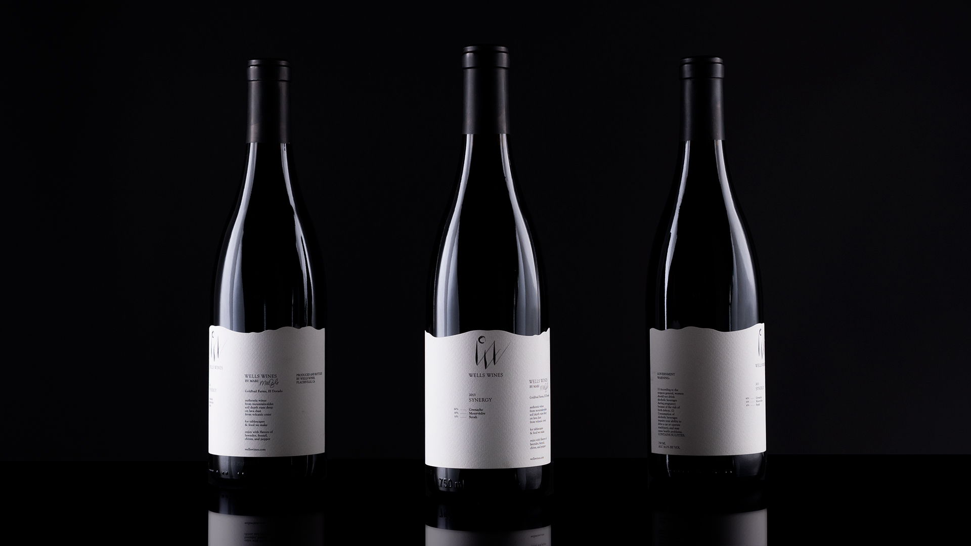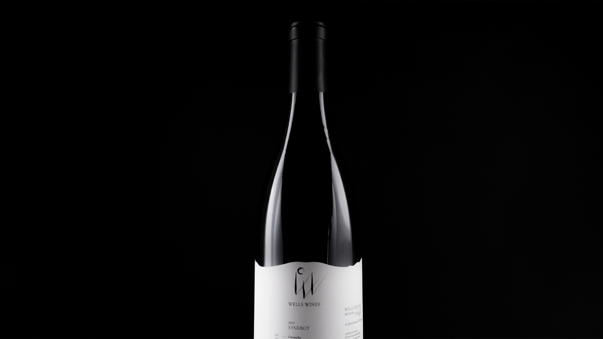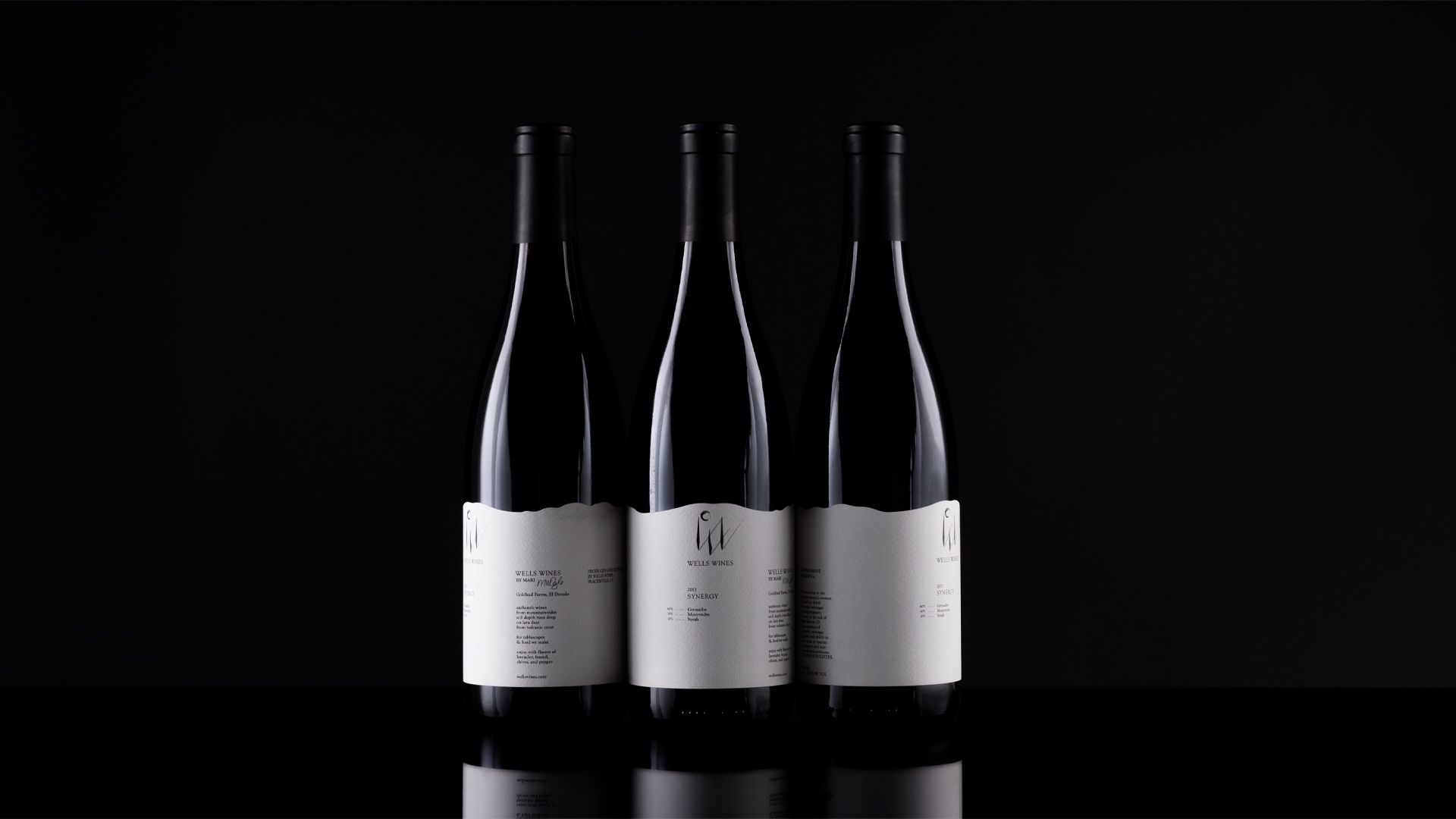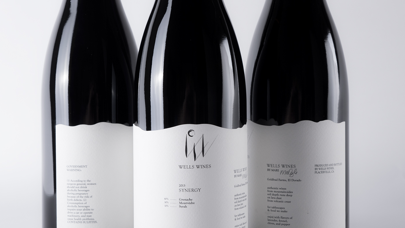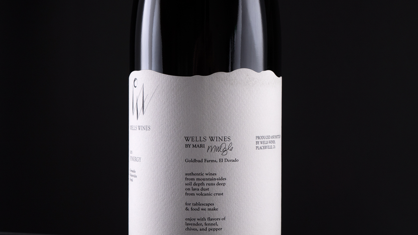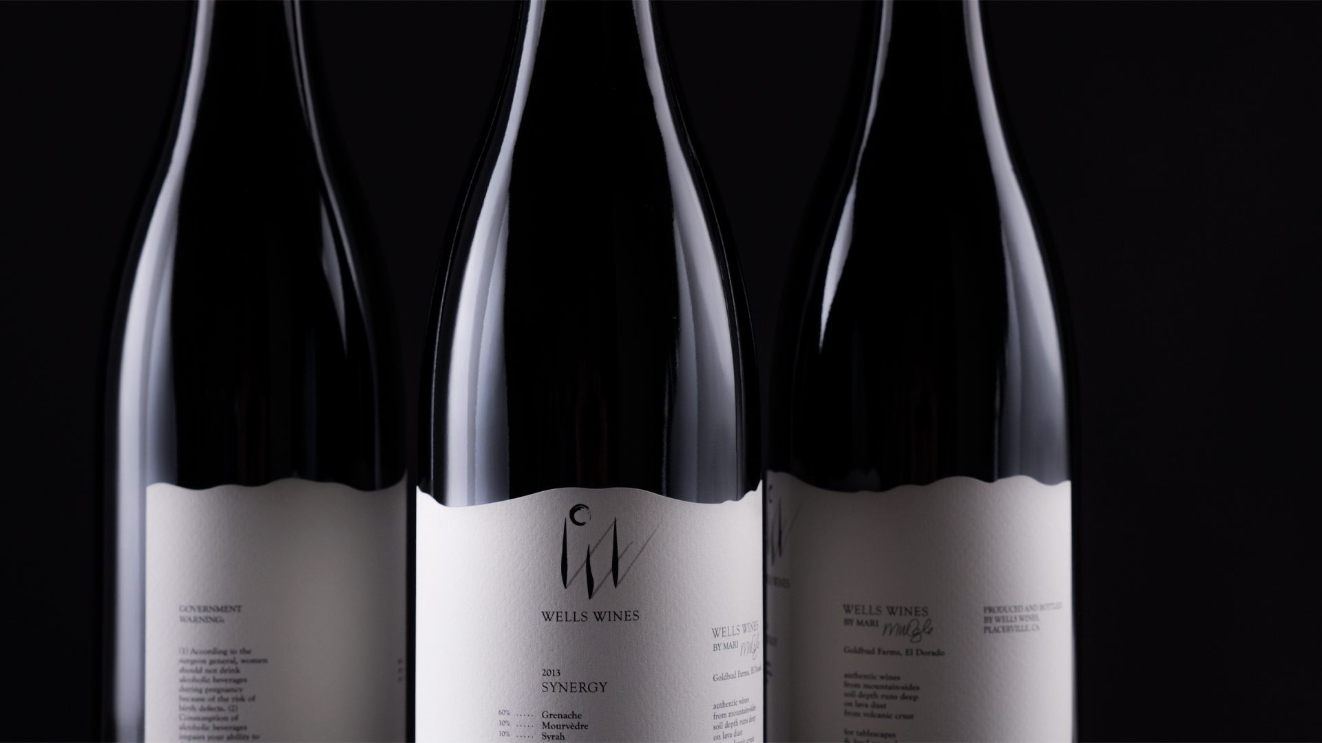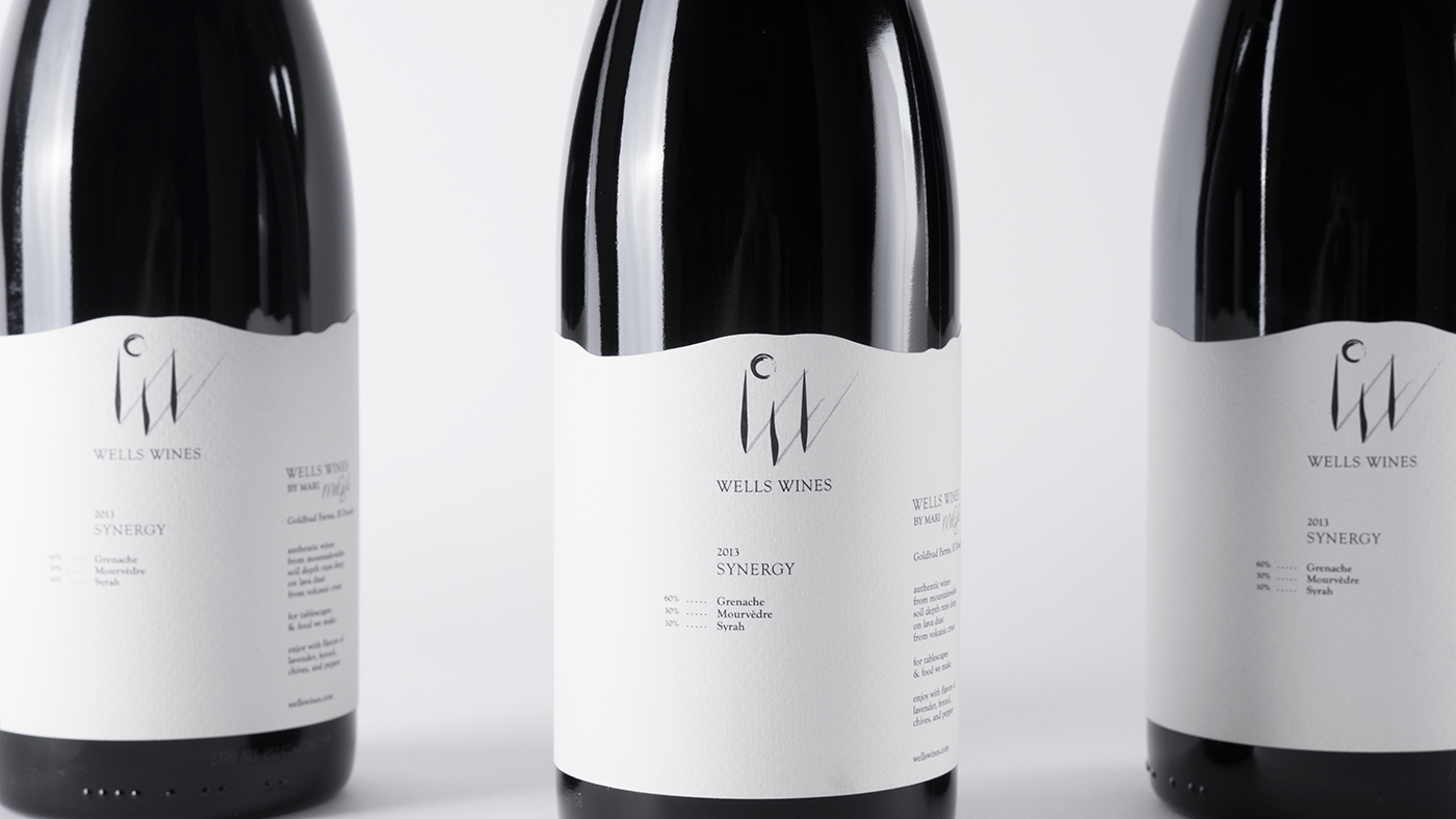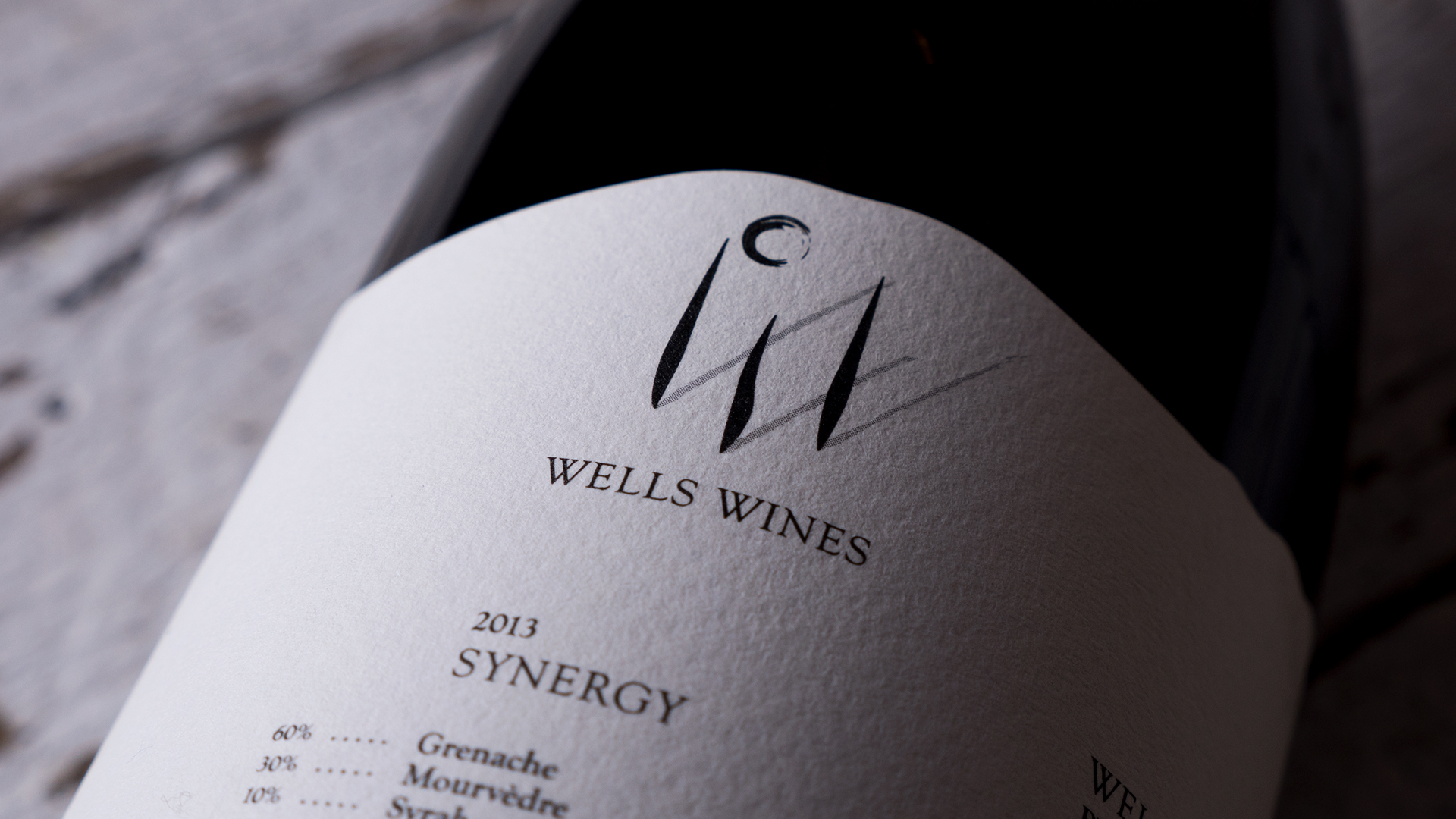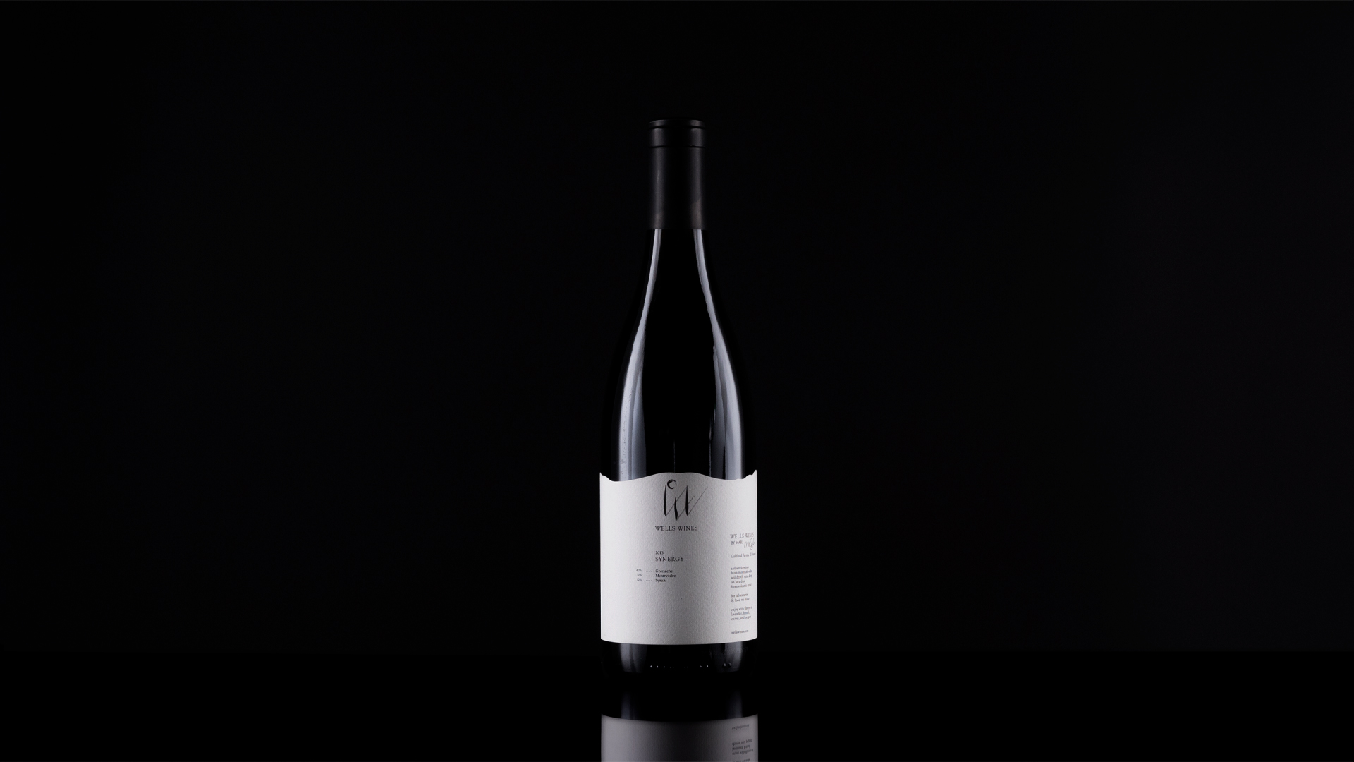
“The label is a work of art, with no detail included without purpose — simple, lovely, and a bit romantic, with a small, traditional black font on a white background. It speaks volumes without filling the label with clutter. It gives off a vibe of a relaxing yet mysterious perfection.”
Theresa Christine Johnson
-The Dieline
• Brand Identity
• Consumer Packaging
• Label Design
• Collateral Materials
