Project Food Box
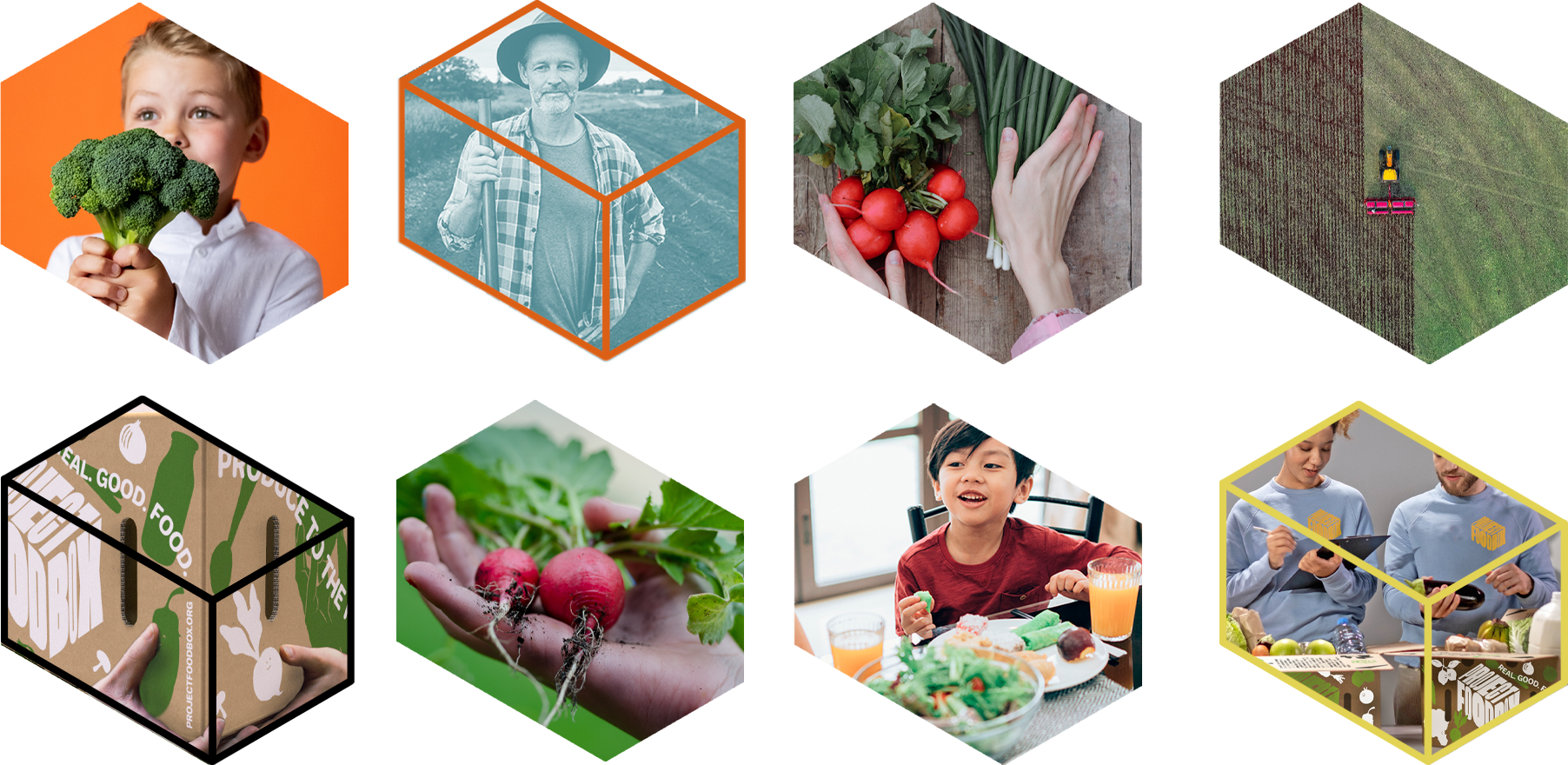
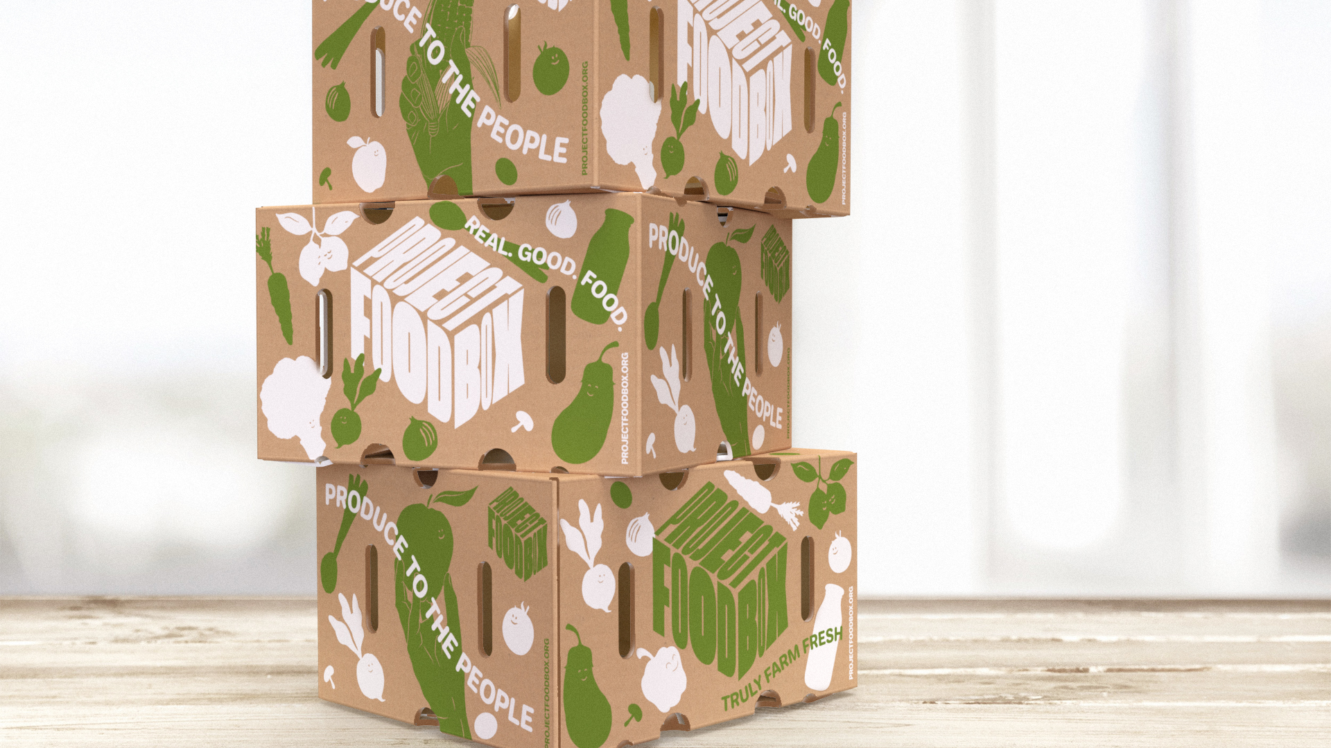
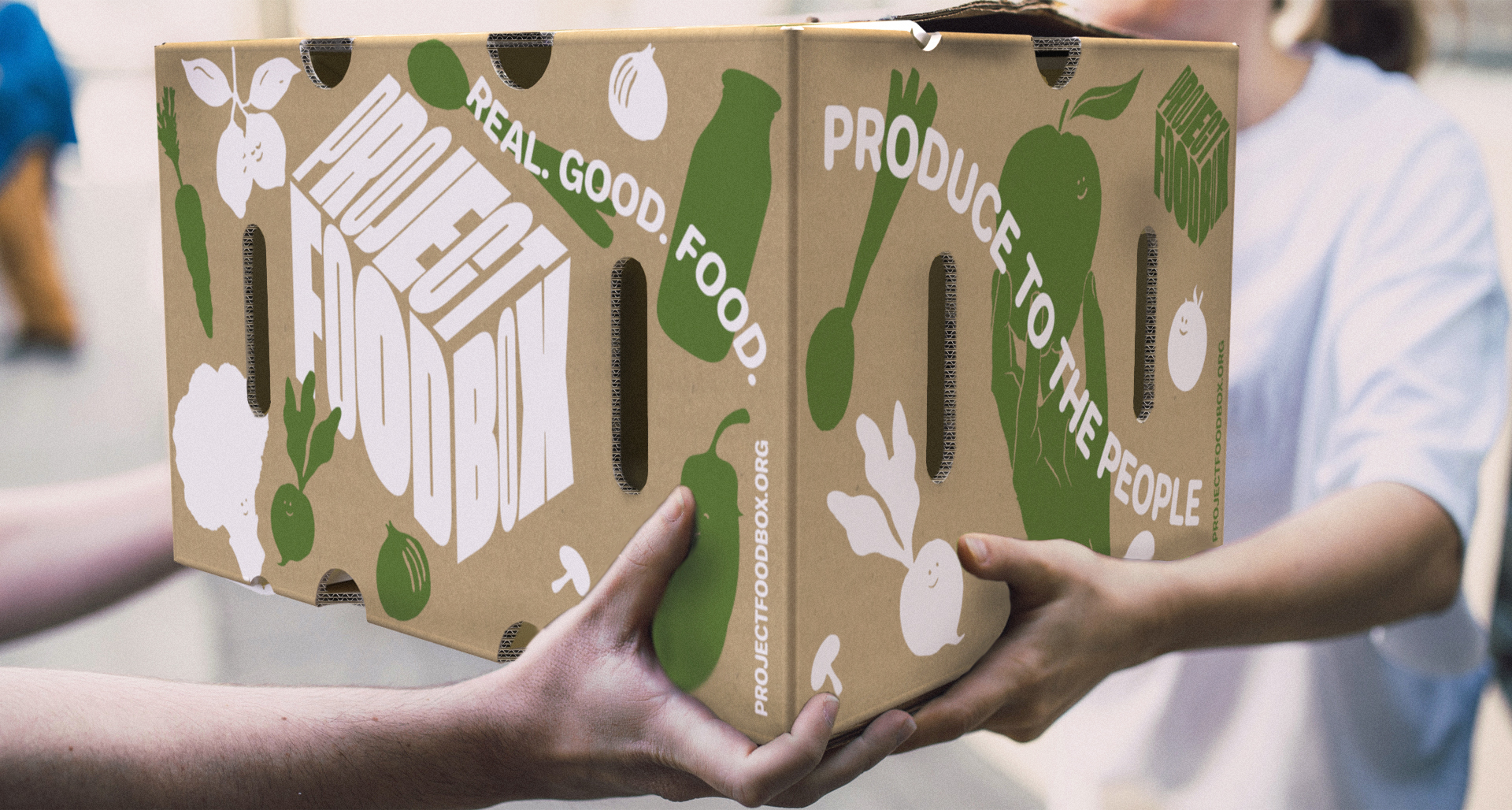
The intention here was to deliver a visual language system that subconsciously directs the viewer towards an inclusive, welcoming and positive emotional space within every interaction of the brand image.
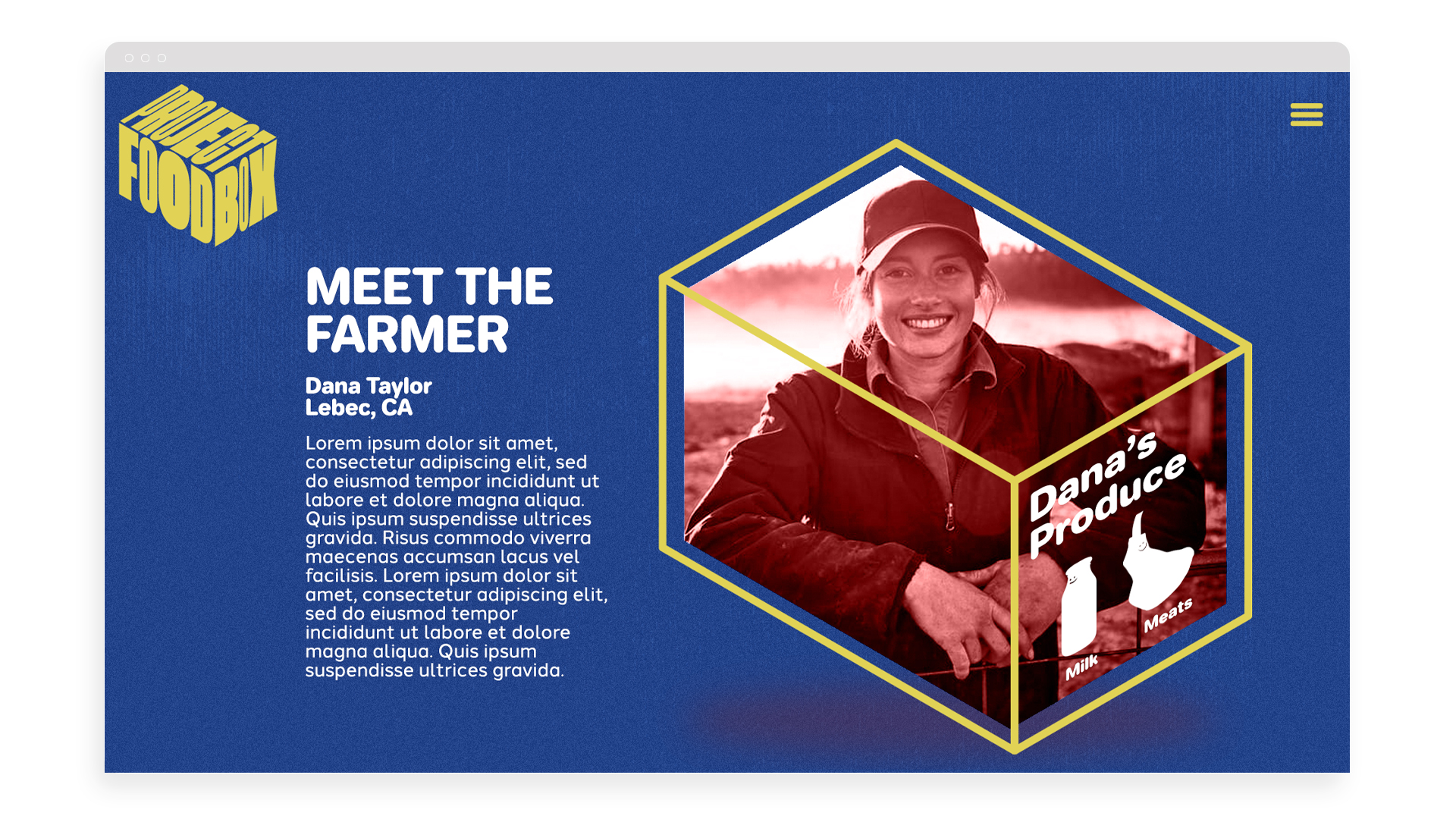
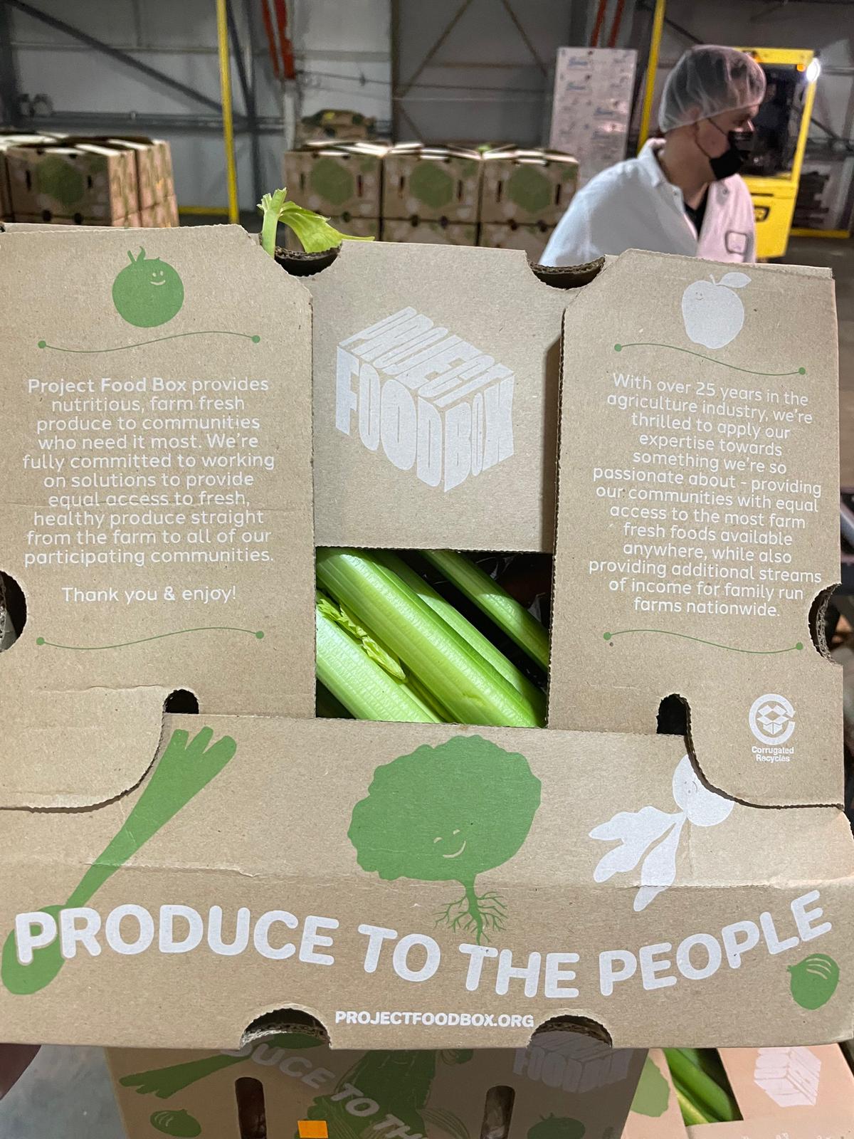
Not solely during these current times of the pandemic, but also generally in the past, there is an interesting, slightly negative connotation towards the world of food banks, the process, the efficiency in which the foods get to the final consumer and of course, the quality of those foods. We wanted to position the company’s niche within this industry in a fresh way, lift the unseen cloud and change people’s perception of this human aid away from the notions of desperation, hardship and turmoil and towards opportunity, family, health and the future. Also, because Sun Terra already has such an excellent reputation as a grower, packer and shipper of fresh, nutritious fruits and vegetables, we wanted to weave the essence and knowledge of that efficiency and proven expertise into the identity of Project Food Box. By visually and verbally offering a window of transparency into the process from farmer to end consumer, the quality of the foods and the efficacy of the supply chain, we’re able to focus on the numerous different problems within the industry the company is solving.
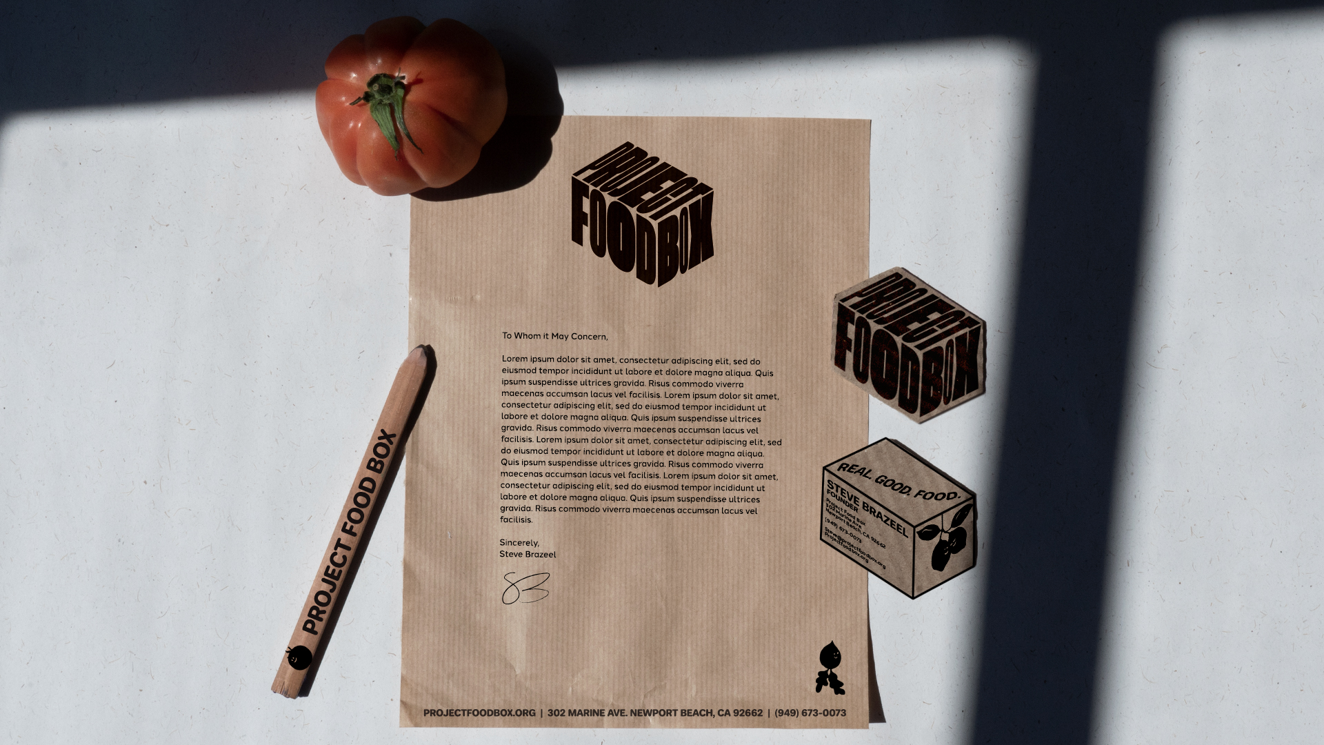
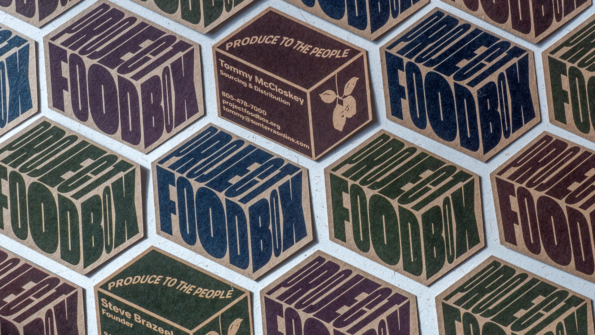
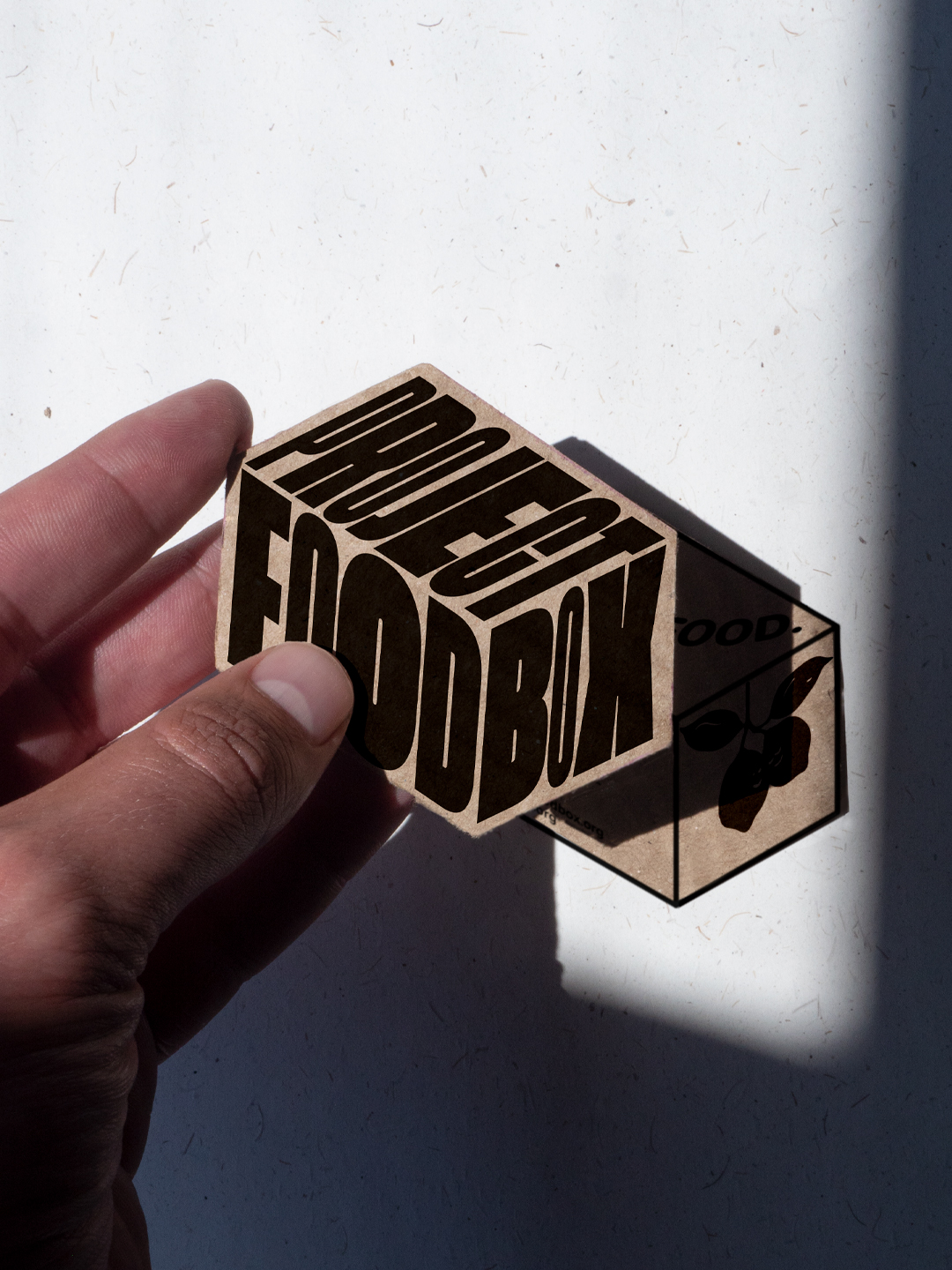
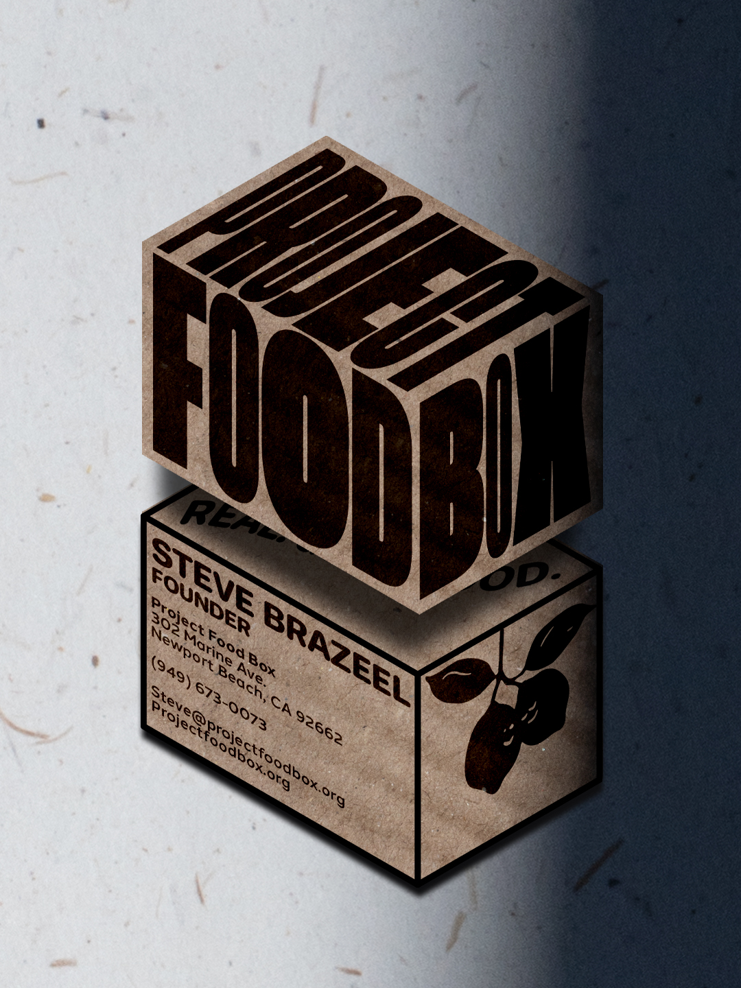
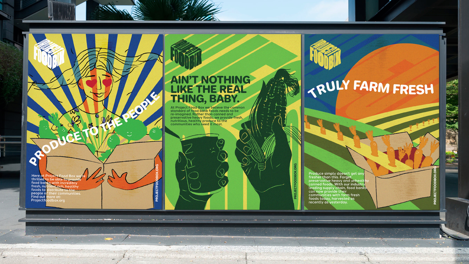
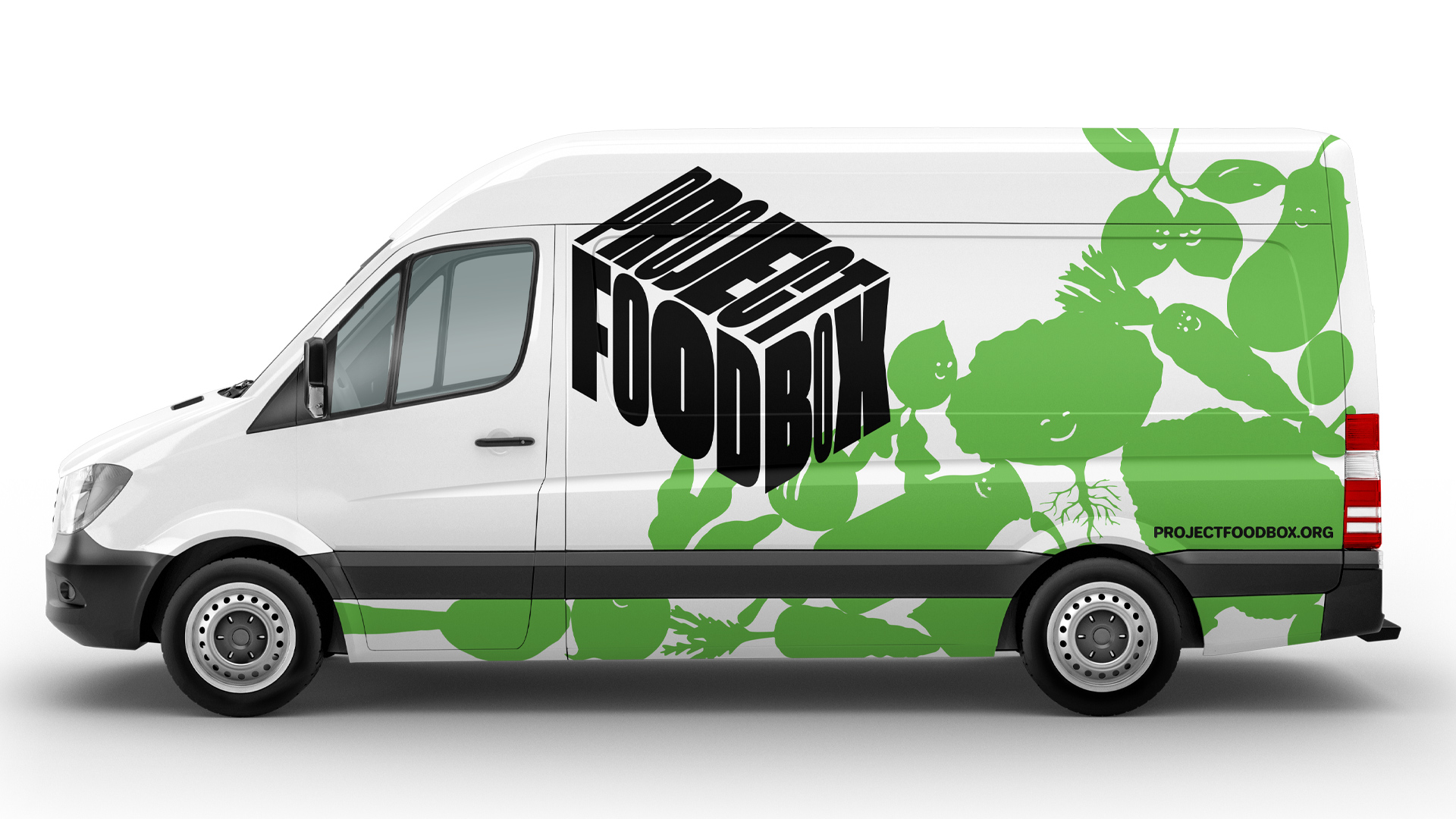
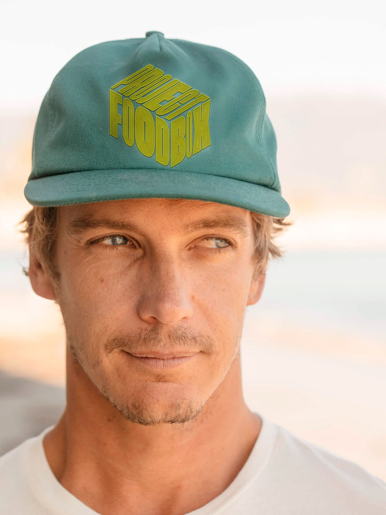
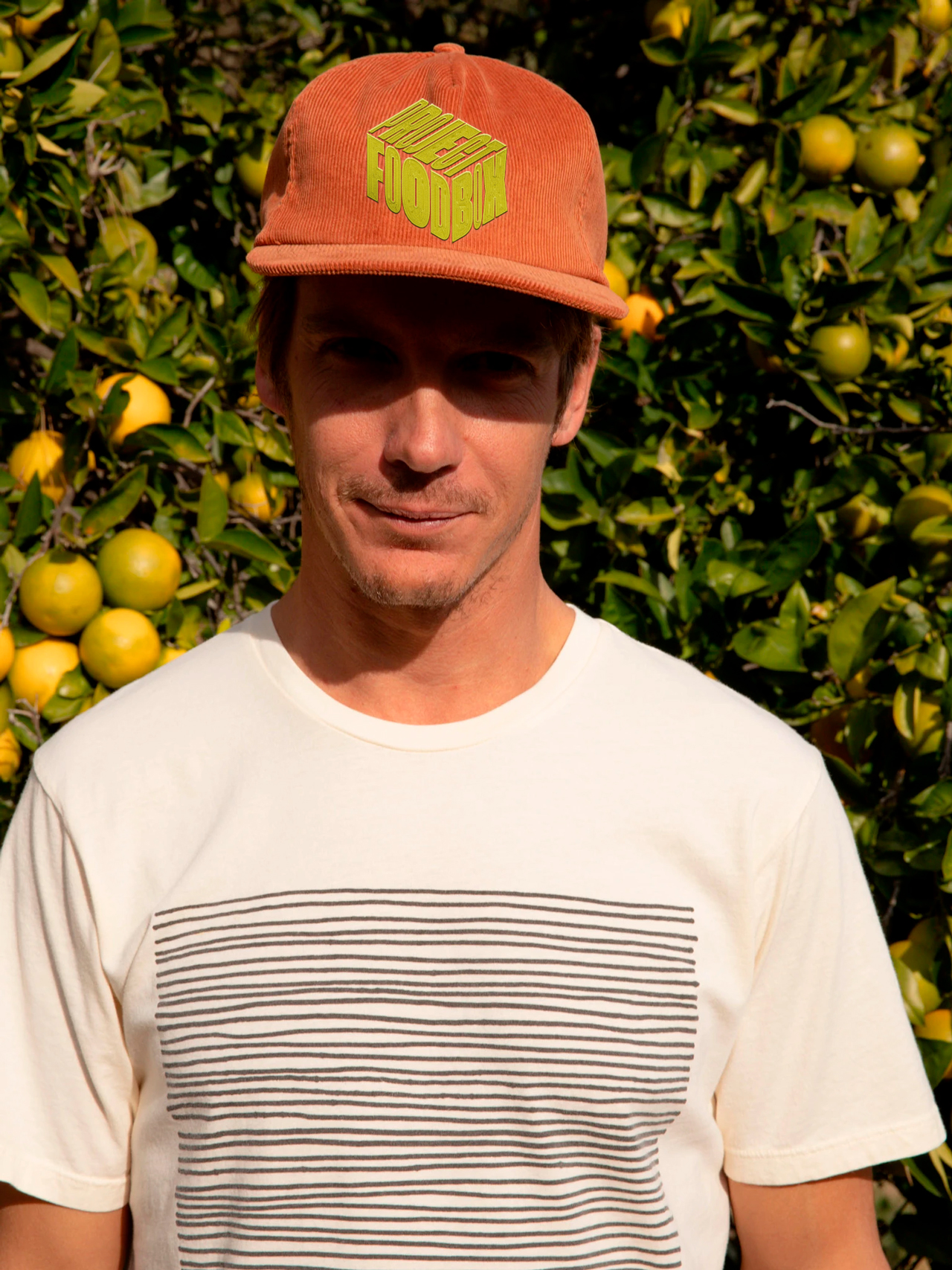
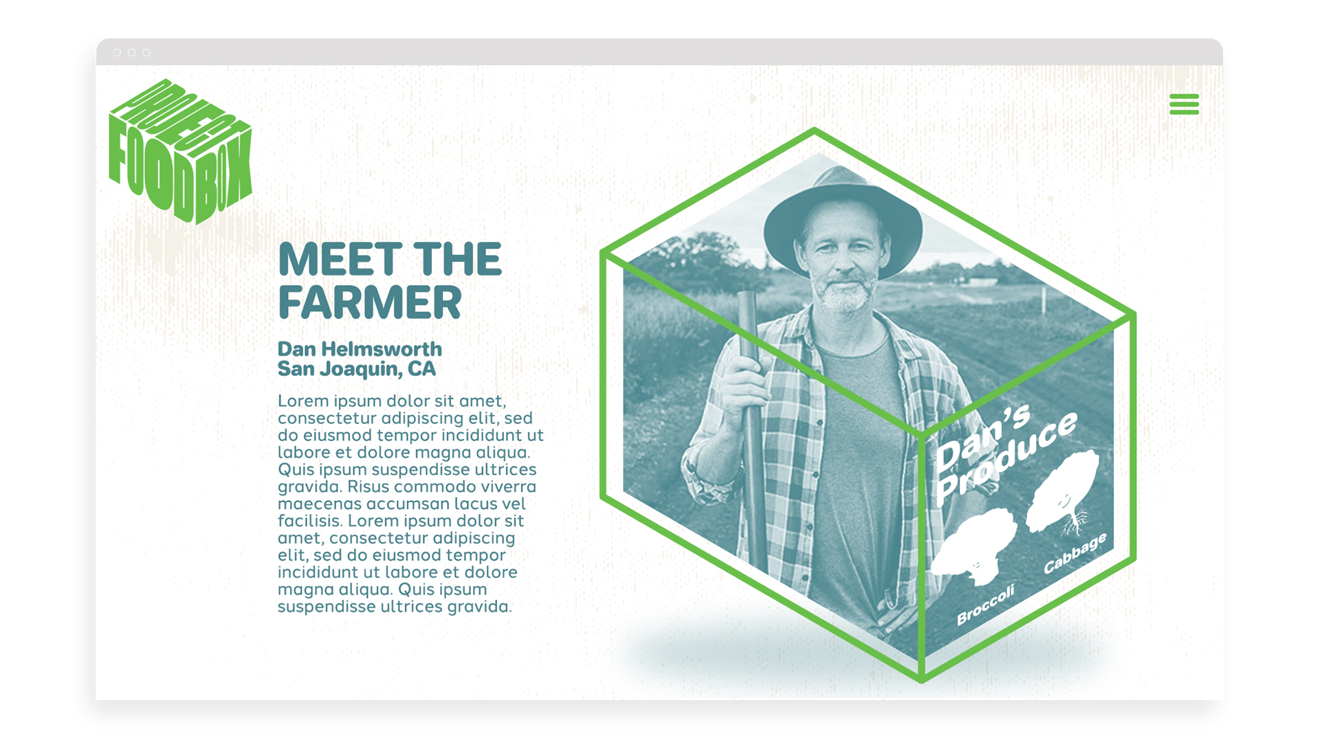
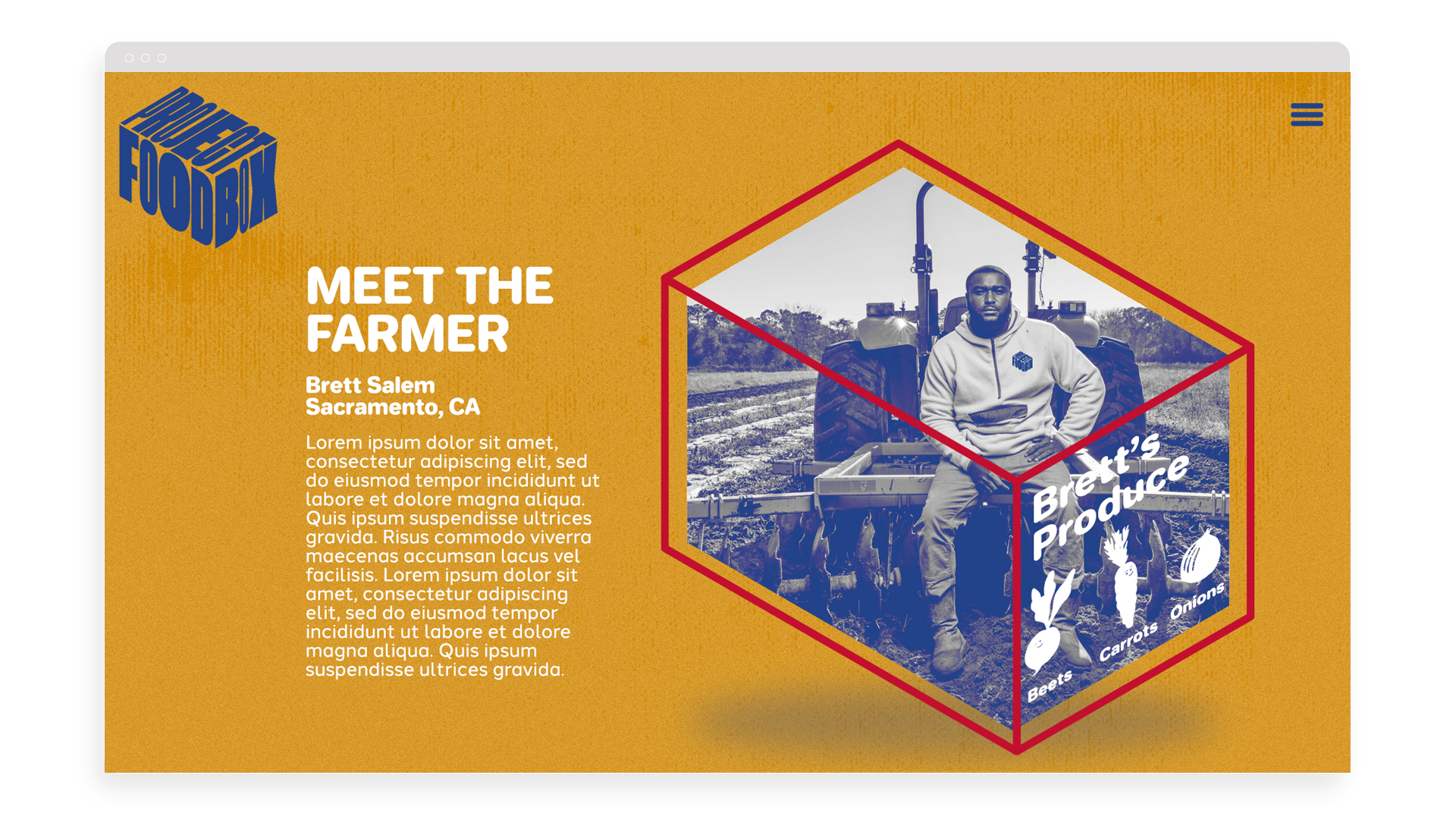
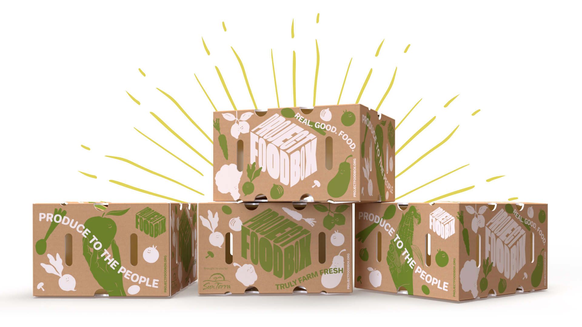
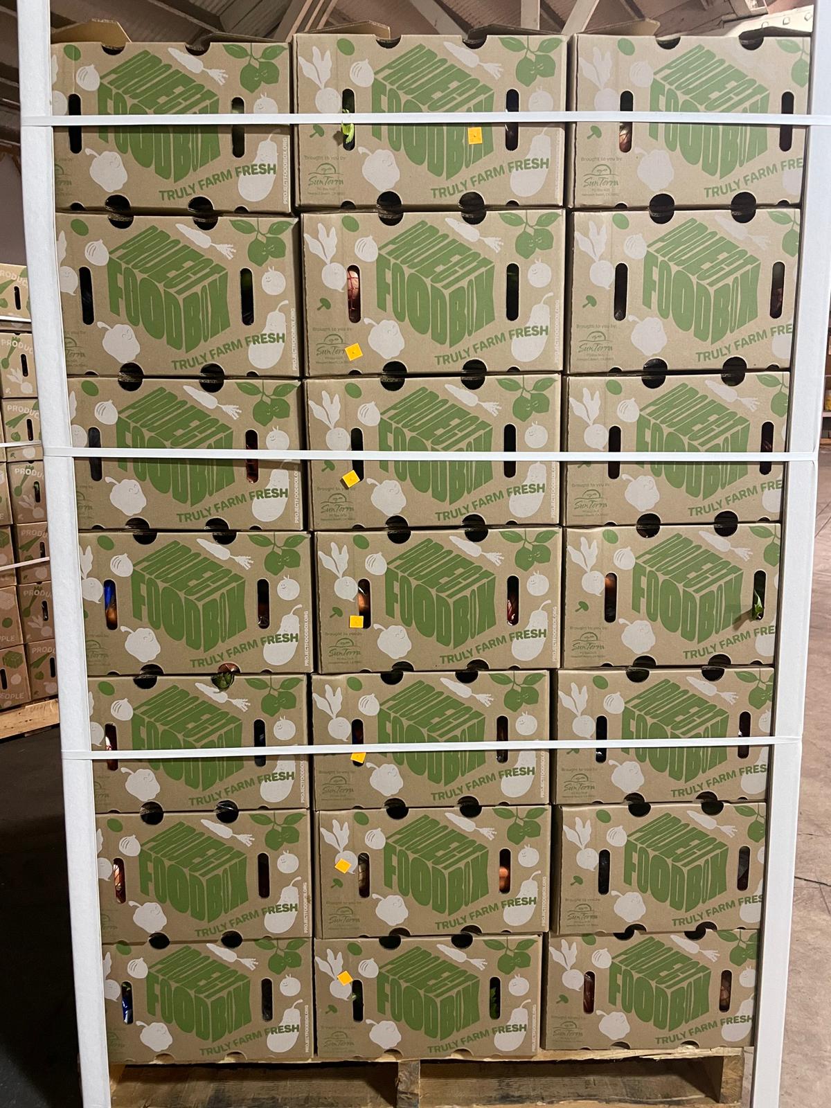
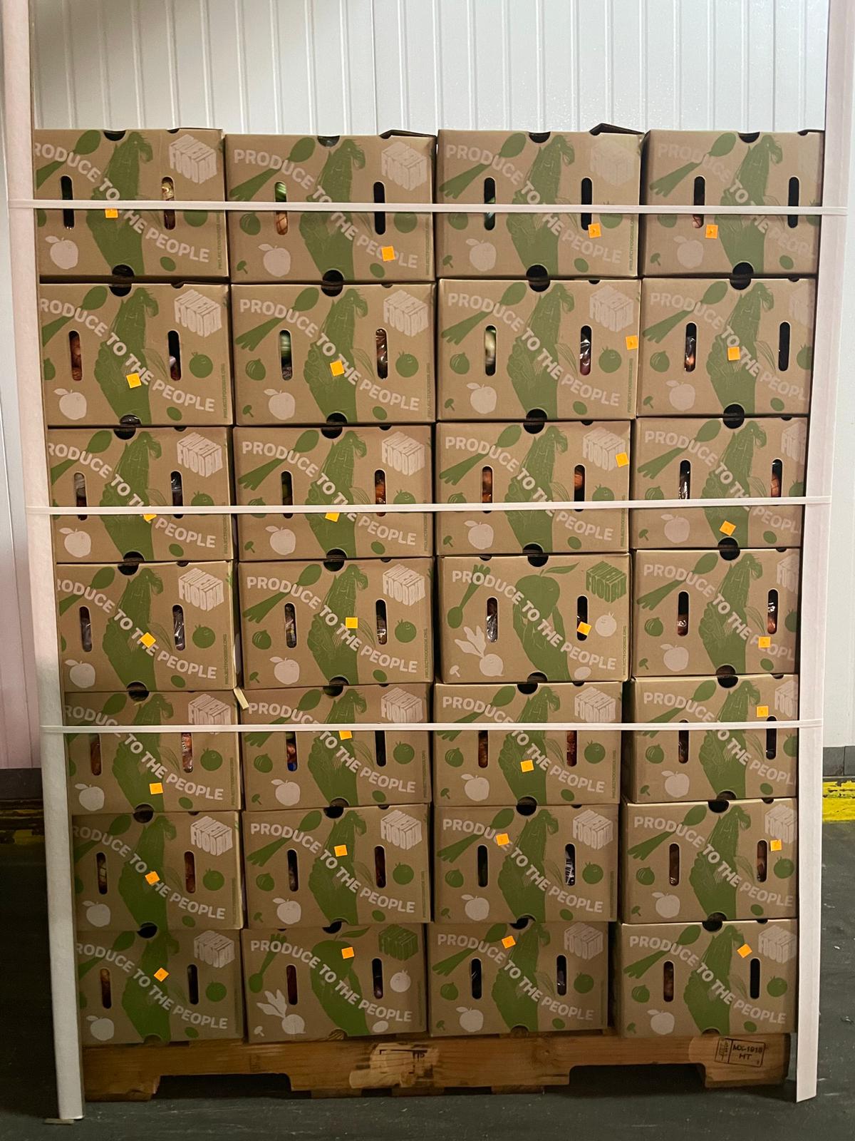
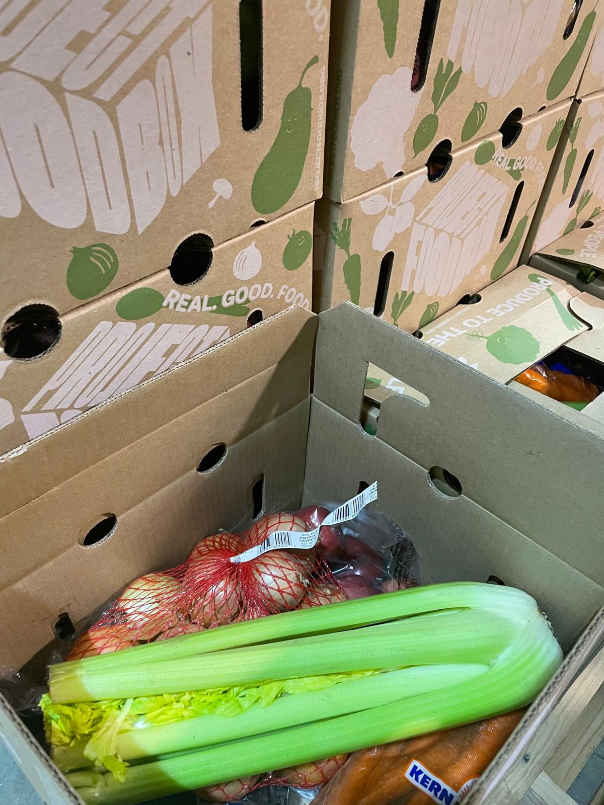
The identity and communications of the brand are to mirror the actual enhancements Project Food Box is providing within the industry. Each interaction of the brand from the organic essence of the wordmark, fresh, optimistic color system, relatable caricatures and illustrations or clever activations, all aim to connect with people in a way that is positive, welcoming, fun, trustworthy and holistically, good.
• Brand Identity Program
• Visual Tone of Voice
• Structure & Strategy
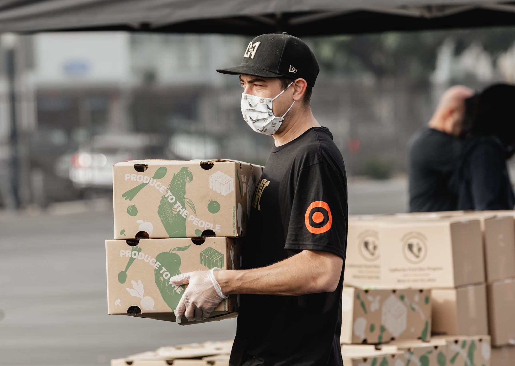
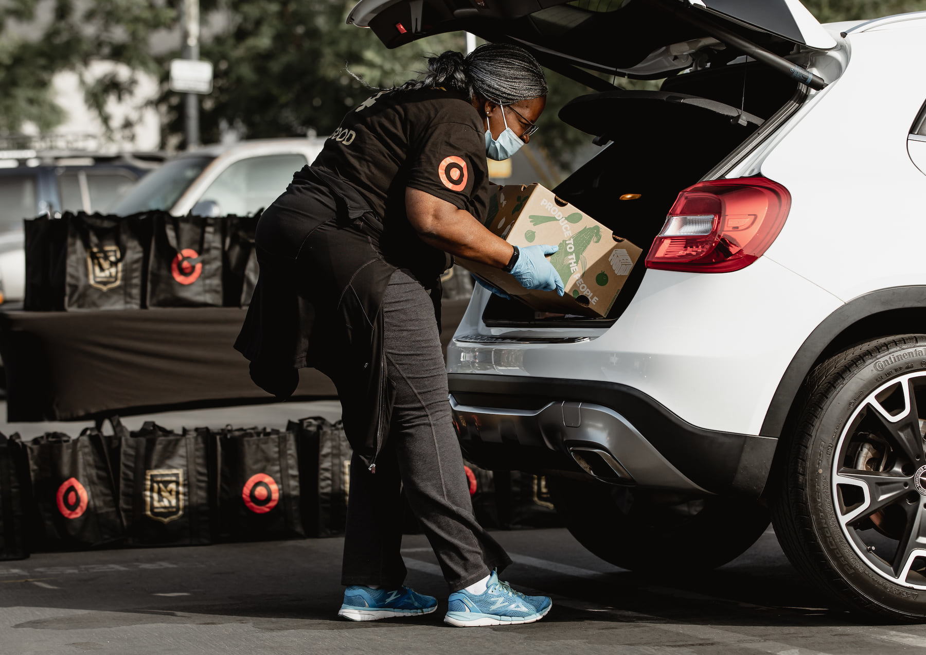
• Packaging Design
• Illustration
• Visual Identity System
• Campaign Activations
• Visual Narrative
• Motion Graphics
• Video
• Creative Messaging
• Advertising
• 3D Renderings
• Merchandise
• Collateral Materials
• Social Structure
• Web Design
