Essential Patch
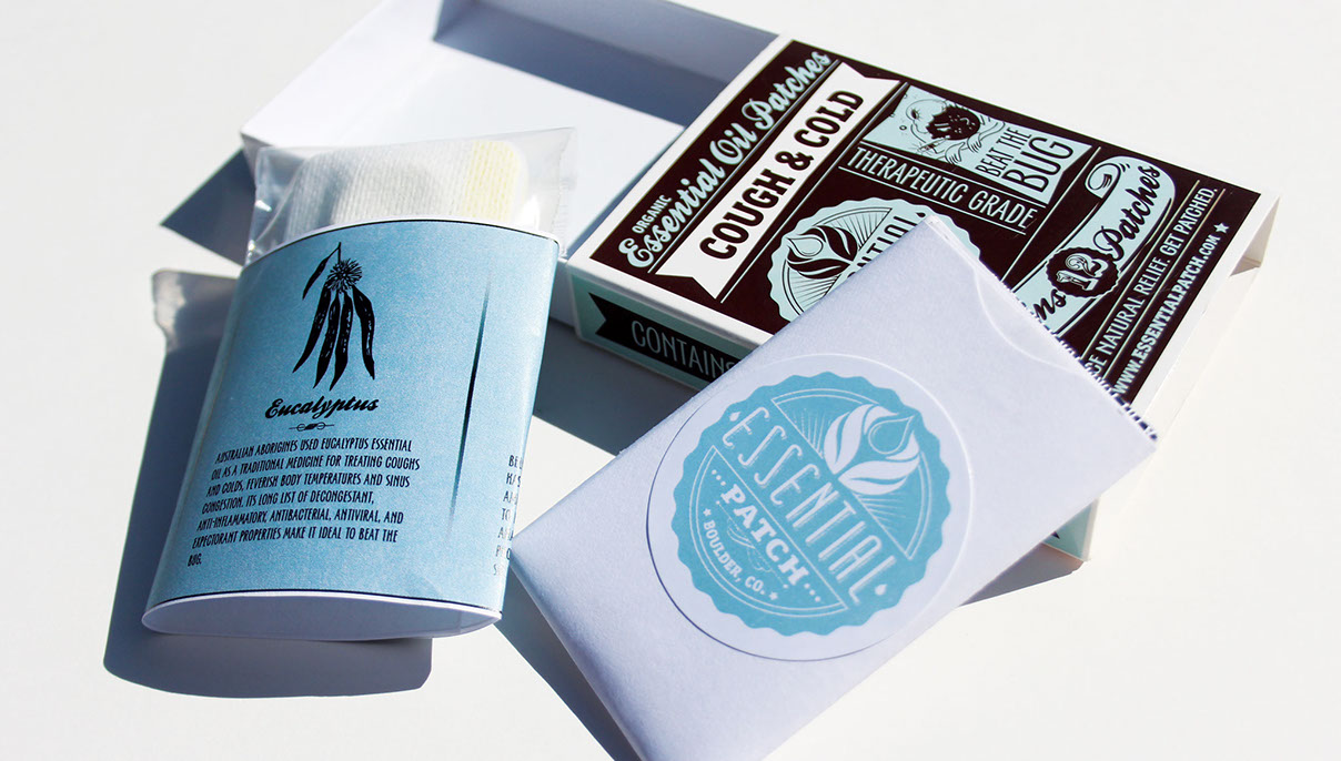
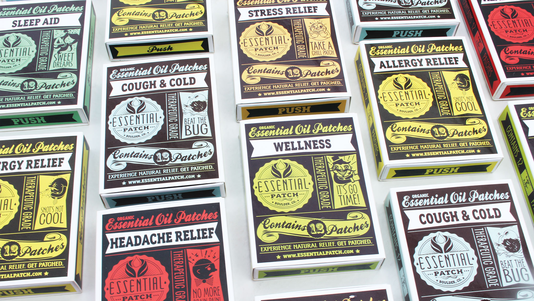
“Grason Ratowsky of Ratowsky Creative came together with the Essential Patch team to create and develop a hip new brand identity, voice and packaging solution for the company’s new line of organic aromatherapy patches.”
-The Dieline
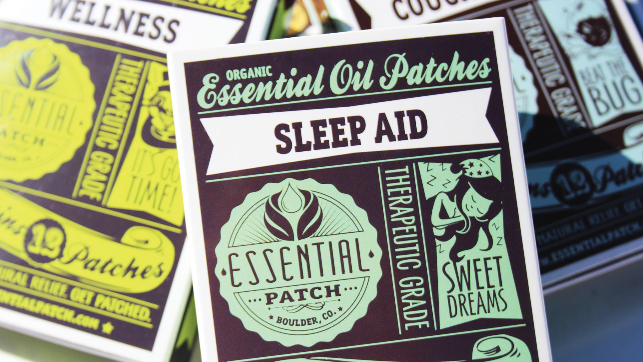
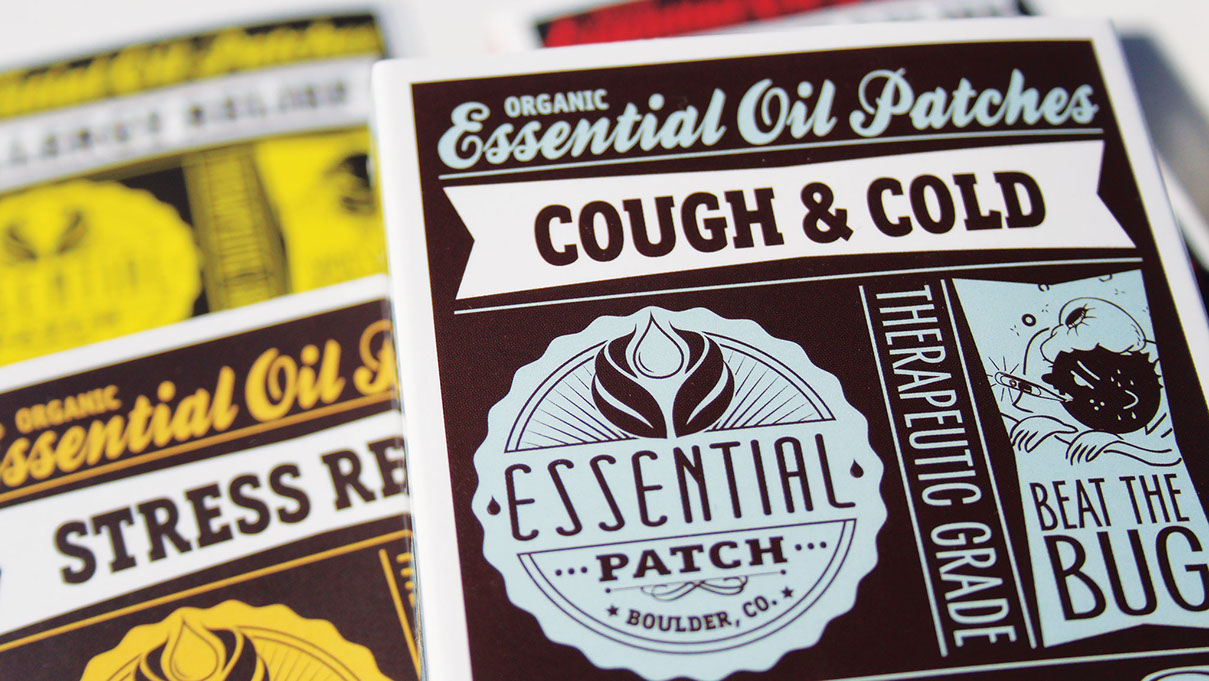
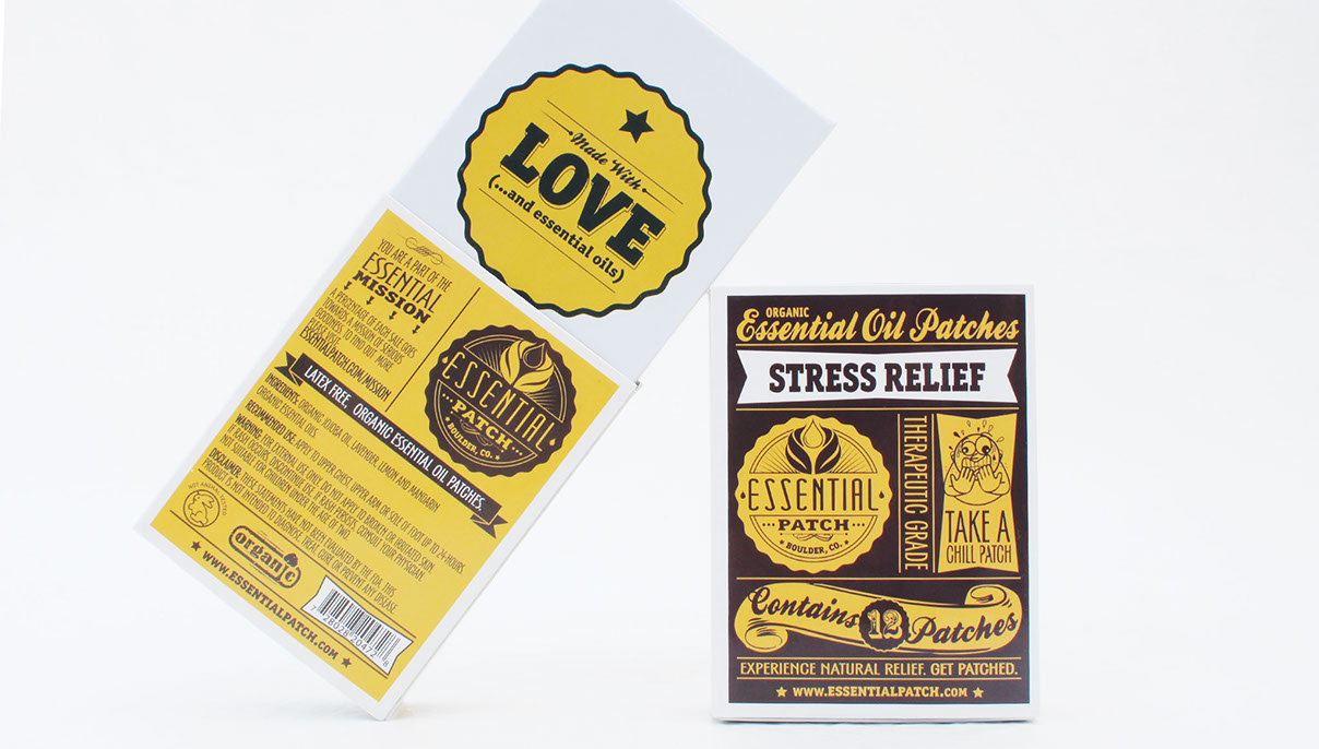
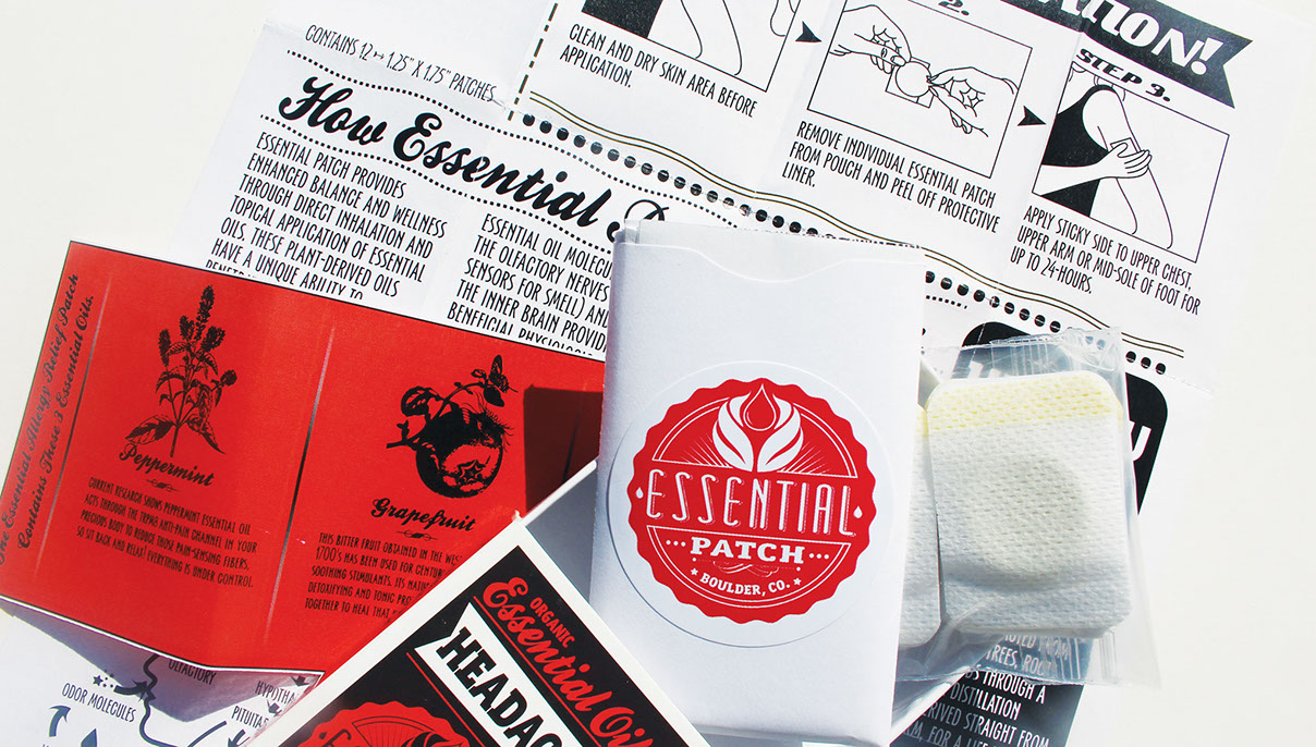
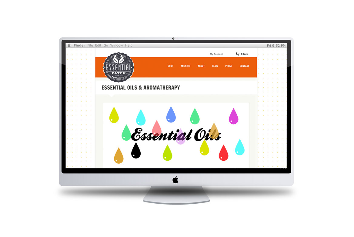
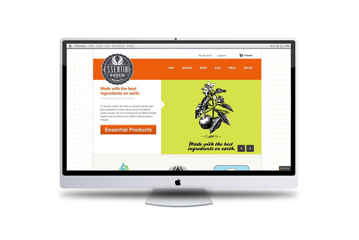
The strategy was multi-layered as the client’s vision was comprised of some major design requirements. Essential Patch wanted an old-time packaging structure paired with bold color palettes to replicate their strong scented aromatherapy patches. They also wanted the design to be hip, fresh and not too earthy. The strategy utilized matchbox styled paperboard packaging, flavorful typography combinations, clever caricature animations and a grid layout with an overall retro feel to embody a punchy combo of vintage and contemporary design.
• Brand Naming
• Brand Identity
• Illustrations
• Consumer Packaging
• Brand Voice
• Visual Identity System
• Campaign Activations
• Customer Visual Narrative
• Creative Messaging
• Web Presence
• Collateral Materials
• Video
• Animations
• Motion Graphics
